


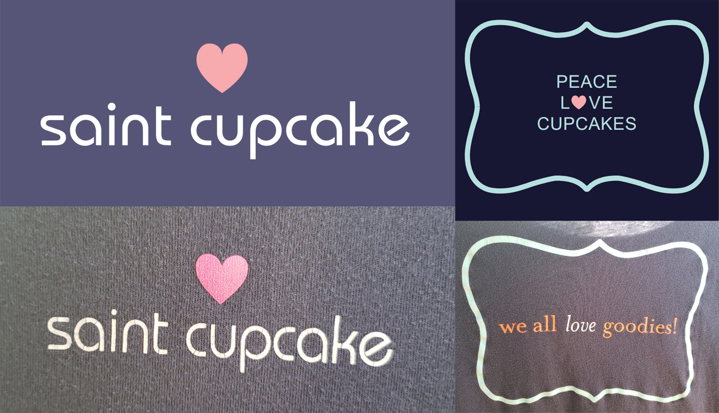
SAINT CUPCAKE
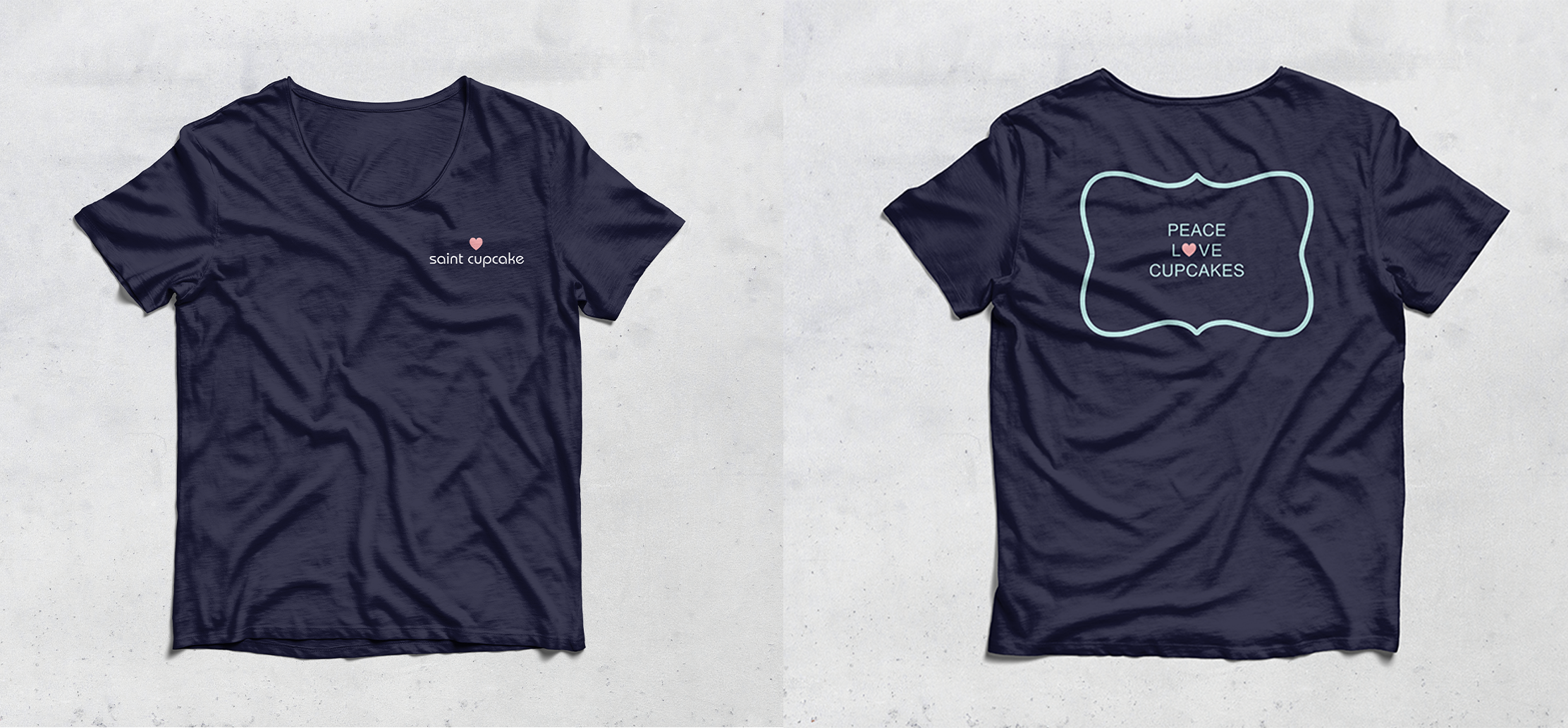
As someone working on gaining legs in the creative world, I was invited by my higher-ups to do some freelance rebranding for our image. They wanted to bring new life to our t-shirts, tote bags, and bakery case labels. I drafted and experimented with ideas for new ways to use their logomark that still contained the essence of Saint Cupcake and its colorful sprinkles. I brought scanned drawings, photos, and digital images into Illustrator to clean up the lines and create proofs that would eventually be reworked into the products you see below. Working within the scope of a bakery and amongst such thoughtful people was a blast, and this company will always have a place in my heart regardless of where design journey takes me.
THE PROCESS

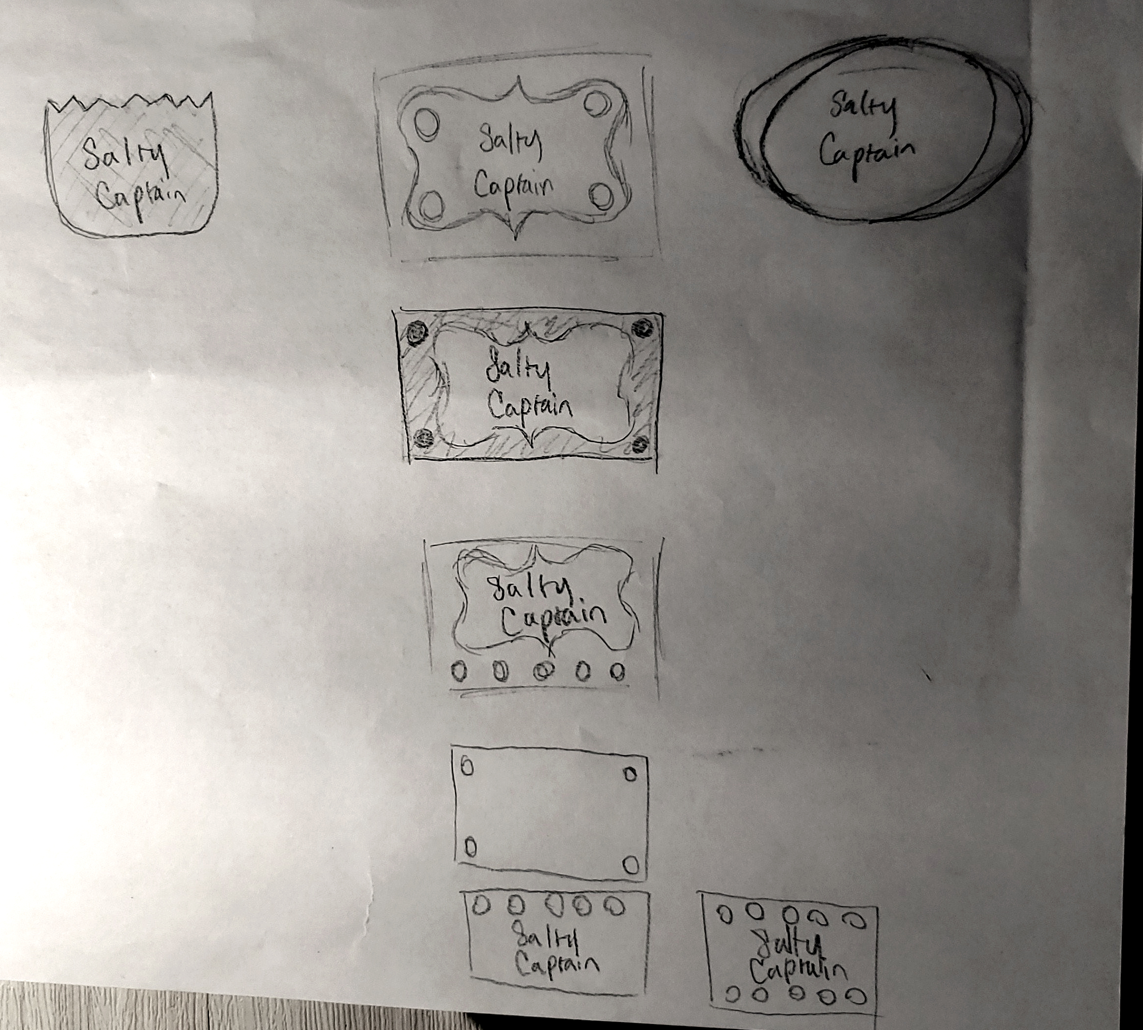
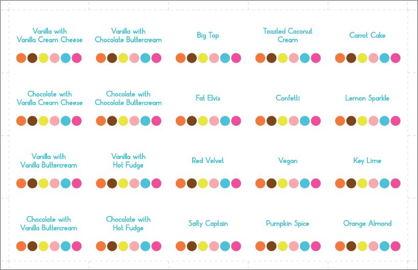
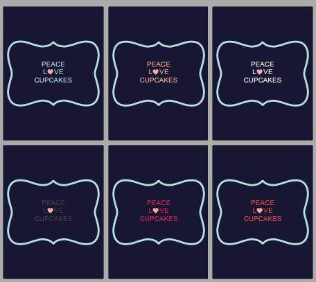
After starting design work at Saint Cupcake I was provided with a jpg logo and, upon request, dutifully vectorized it for use on our A-frame sign outside as well as in the below projects. Saint Cupcake's logo is a soft eggshell blue crest with graceful curves. The typeface, MB Picture House One, has thin and elegant lines and round, playful bowls. Below the company name are small dots in 5 different colors to symbolize both the sprinkles on cupcakes as well as the shop's founder, Dot. As a whole, the design spoke to a clean yet fun-loving brand. I took these elements into consideration in all that I produced for the company.
Top: Final design; Bottom: Original design.
THE RESULT

The laminated labels for the cupcake display went through many iterations before I redesigned them in 2018. My vision was something simple, fun, and consistent with the company's branding.

Along with the new t-shirts, my design was also applied to cute, simple tote bags that customers were drawn to through while waiting in line for sweet confections.