AMBIENCE LIGHTGLOVING CLUB
THE OCTOPUS
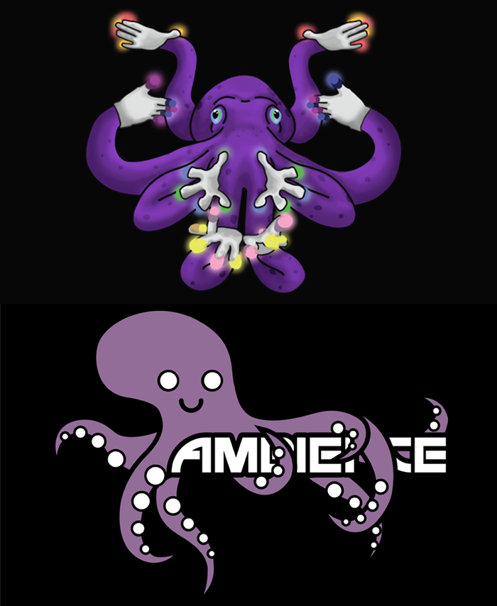
For a reason unbeknownst to most of us, Ambience has, for a long time, been represented by a purple octopus. The organization's main colors are black and purple and many of its artwork pieces feature bubbles, which explain its suction cups. Yet, a question remained: why was the octopus never wearing lightgloves?
The idea of having our mascot utilizing its appendages to its maximal advantage and wearing not two but eight gloves was a humorous image. You can see to the right the before (bottom) and after (top) of the implementation of my idea.
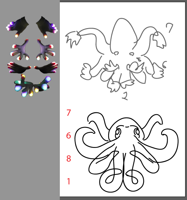
I started by studying the general structure of octopi and squids. Stock photos of lightgloves were unsurprisingly difficult to find for this use-case, so I took screenshots of youtube videos until I had gathered a decent selection of poses. Using this, I cut out the gloves and tweaked them until they fit with the general vision I had for the octopus body.
With some shading and color adjustment to match bright, rainbow glow of LEDs, I had a fun, strange, and eye-catching graphic that would later be added to t-shirts and an event banner.


Top: t-shirt design iterations;
Right: Photoshop process for Glovecon event banner

THE MASKED GLOVER
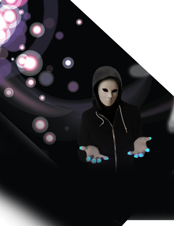
In a similar fashion to my experience with the designs above, a lack of viable stock photos led me to do my own photoshoot in order to produce viable images that I would then compose into a poster advertising our club. In a similar fashion, I aimed to make the piece stand out and feel consistent with our brand. The color scheme was black, white, grey, and our iconic purple. The poster would feature the same light bubbles and beams that were seen throughout our club's past content. The club logo and contact information was left in a striking white to ensure quick readability, while the tagline and complementary information was in grey to fade it into the background. A striking black background gave the masked figure and the pops of color more gravity in the work. Through an anonymous, mysterious figure, my idea was to both pique interest and convey that anyone viewing the poster– regardless of race or gender –could be the performer underneath the mask.


